
Modals are very easy to create in UI Builder, however it’s not immediately clear how to create one that’s of a non-standard size.
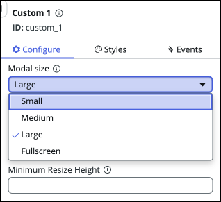
The Modal size property of a modal has 4 size options: Small, Medium, Large, and Fullscreen. But what about if none of these options suit and you want to manually specify the dimensions?
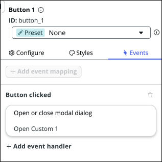
You can do this in UI Builder with the payload of the event you’re using to trigger the modal.
For example, on the “Button clicked” event of a button component:
You can edit the Display options (advanced) object:
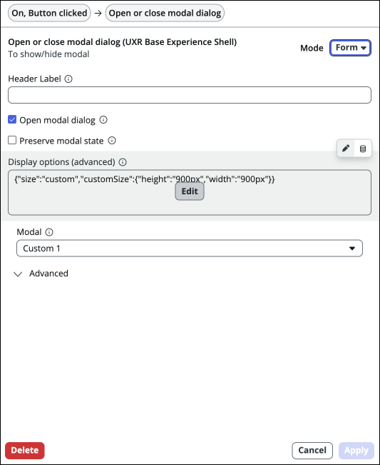
And on that object add the size and customSize properties as shown in the screenshot below:
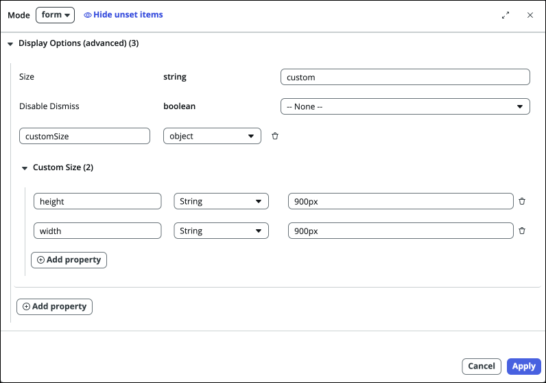
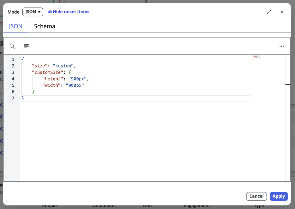
Alternatively you can change the Mode of the editor to JSON and directly supply the payload with those properties.
{
    "size": "custom",
    "customSize": {
        "height": "900px",
        "width": "900px"
    }
}
How are you using modals in UI Builder? Share in the comments below if there are any other areas of using a modal that you would like to see me write an article about.