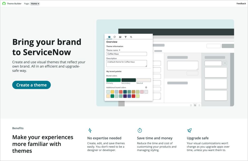
Theme Builder is a powerful, easy to use application available for installation from the ServiceNow Store which became available for the first time in early 2023. It guides administrators & application creators through creating a theme in ServiceNow by choosing colours, uploading a logo, and previewing how it looks on various pages in the Next Experience.
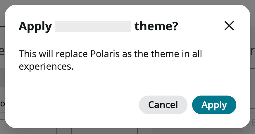
As of writing, Theme Builder appears to be intended to design new themes that can wholly replace the out-of-box “Polaris” theme. This is the theme that applies to the Unified Navigation, which is what you see when you enable the Next Experience UI and access /now/nav/ui on your instance. When you finish creating a theme, and click the Apply Theme button, you get the message “This will replace Polaris as the theme in all experiences”:
However, there are situations you may encounter where this is not exactly what you want. Perhaps you want to keep the Polaris theme applying to some experiences that leverage the Unified Navigation, and have another theme you created apply to other experiences that also use the Unified Navigation.
For example, perhaps you built a custom experience for suppliers to manage their interaction with your business. You might want this application to have a left-hand sidebar, and navigation breadcrumbs at the top (i.e. to use the Breadcrumb App Shell), but you want that experience to be themed differently to the way your regular employees see their experiences.
So how can you leverage Theme Builder to create themes, and have them apply to only select experiences? Read on to find out.
Understanding App Shells
App Shell’s are the wrappers for experiences built with the Next Experience. In Utah, there’s the Breadcrumb App Shell, Header App Shell, and Workspace App Shell available to customers. The App Shell is the persistent elements of the interface as you navigate between pages of an experience. For example, the header, footer, sidebar, and other similar elements, as shown below.
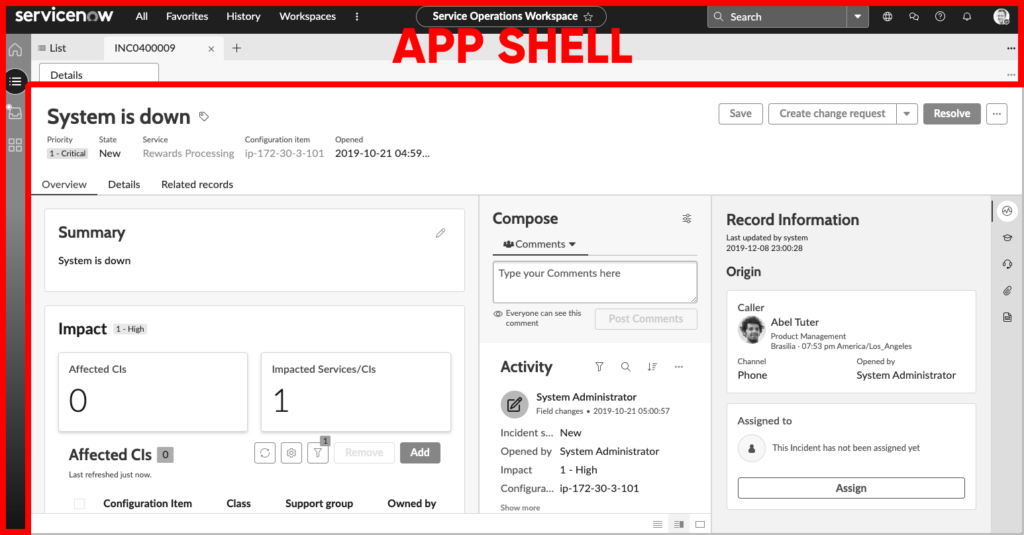
Prior to Next Experience, each experience had its own App Shell, and each opened in a new tab. For example, opening the Service Operations Workspace (which uses the Workspace App Shell) in UI16 opens in a new tab. Each App Shell contained everything surrounding the page, such as the header, sidebar, breadcrumbs, etc.
With the Next Experience UI activated, you’ll notice opening the same Service Operations Workspace stays in the same tab when opened from the application navigator, with the header of Next Experience UI remaining and everything underneath it changing.
This is because of a subtle, but powerful change to understand that happened with the San Diego release. Essentially, an App Shell can now be broken down into two different concepts:
- Experience Shell – The individual shell used for a particular experience. For example, Service Operations Workspace uses the Workspace App Shell, and you might have a custom experience that uses the Breadcrumb App Shell.
- App Shell Root UI – The upper-level shell that unifies experiences and keeps them consistent.
An illustration of this can be seen below:
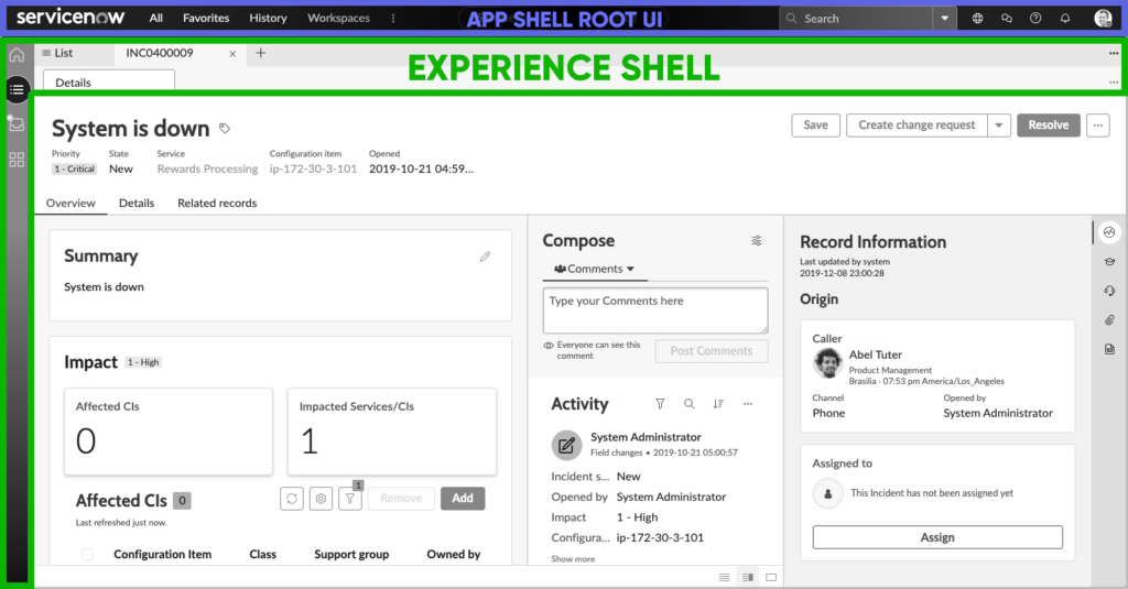
Splitting the App Shell into two allows for true Unified Navigation between experiences. The shared elements of the Workspace and Breadcrumbs App Shells can be moved up a level into the App Shell Root UI, and so when you navigate between experiences that use these App Shells, just the inner parts of the application can change, rather than needing to open a new tab.
Technically, the screenshot above doesn’t tell the full story, as the App Shell Root UI can also contain other shared elements like session data, routes, error handling etc. It can basically be any common functionality shared by the Experience Shells that live inside it.
It’s worth stressing that this behaviour is optional, which I will explain in the following section.
Introducing UX Parent Application
The concept of a “Parent app” is new as of the San Diego release of ServiceNow, and is something that assists with ensuring that separate Next Experience applications can behave in unison together as a single unified experience. Parent apps are stored in the table called UX Parent Application (sys_ux_app).
There’s an out-of-box record called Unified Navigation app shell in this table by which the theme for the Next Experience UI is set. You’ll notice on this table it has a Base theme (theme) field. As you can see, on my instance the Base theme for this record is set to Polaris.
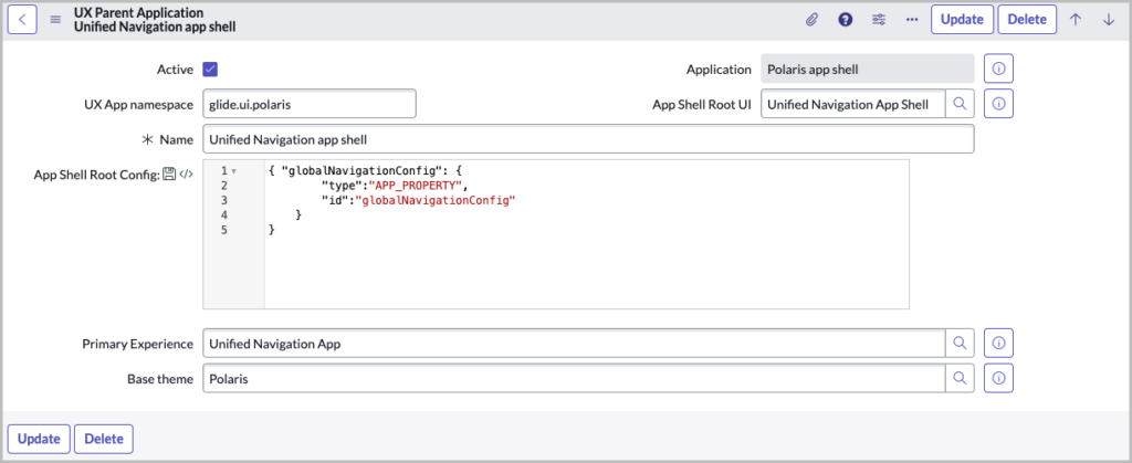
Essentially, this UX Parent Application defines a group of Experiences that will all operate together as a single unified experience.
Knowing this, it’s clearly this record by which you choose the theme that applies. And given this is a reference field, and there’s thus no way of defining multiple themes (you can only have 1 reference in a reference field), it’s clear we need to create a new one of these records if we want to us a specific theme for an experience.
It also has an App Shell Root UI (shell_root) field on it, which determines for any Experience with this Parent App, what their App Shell Root UI will be.
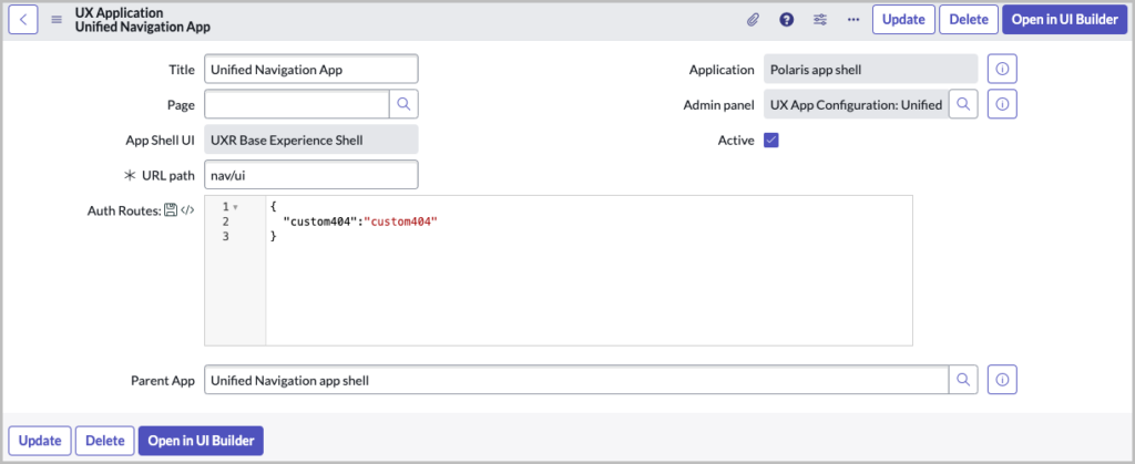
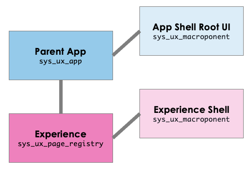
If you open a UX Application record (sys_ux_page_registry, the table that Experiences are defined in) such as Unified Navigation App you’ll see it has a field called Parent App (parent_app) that points to a UX Parent Application (sys_ux_app) record. It’s this field that determines the assignment of experiences to their Parent App.
To below diagram should assist in understanding the this relationship between the various records:
Creating a UX Parent Application
So with the above knowledge, this makes clear that to have an experience use a theme different to that used by the Unified Navigation App, we will have to create a new UX Parent Application record.
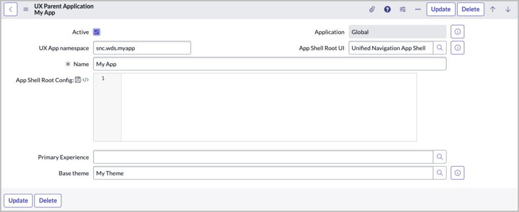
Let’s create a new record, completing it with your own variation of the below:
| Field | Explanation |
|---|---|
UX App namespace (user_preference_namespace) | Set this to something unique if you wish. |
App Shell Root UI (shell_root) | Unified Navigation App Shell |
Primary Experience (primary_experience) | Leave this blank for the time being |
Base theme (theme) | The theme you created in Theme Builder that you want to apply to experiences using this Parent App |
The next thing we can do is set our custom experience to point at this new Parent App. You’ll notice though that if your experience is using the Breadcrumb App Shell or the Workspace App Shell, then the Parent App field automatically updates and locks to pointing at the “Unified Navigation app” shell Parent App. This is because of an out-of-box UI Policy that you need to disable first, called “Set parent_app to Polaris app shell if experience app shell is Workspace app shell or Breadcrumb app shell”.
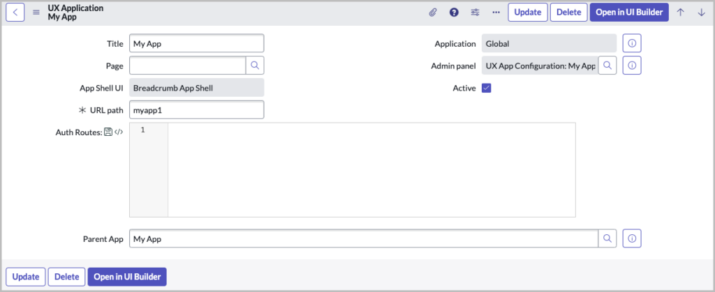
Once you’ve disabled that, you can go ahead and set the Parent App field of your experience to your new Parent App you created.
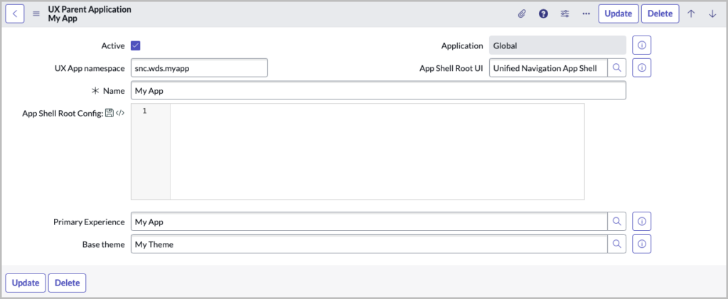
And then you can go back to the Parent App you created you can set it’s Primary Experience (primary_experience) field to your custom experience.
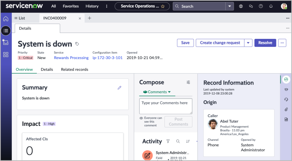
Now, when you open up an out-of-box experience using the Unified Navigation app shell Parent App, you’ll see it opens with the Polaris theme:
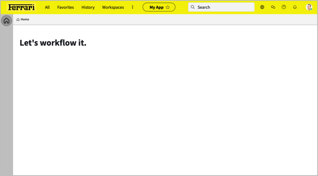
And then if you open your custom experience using your new Parent App, it uses the theme you defined for it!
Alternatives
Given you have to disable an out-of-box UI Policy to achieve this is not comforting regarding the likelihood of getting ServiceNow Customer Support assistance if you require it if something goes wrong with this technique. So following this process is very much a “buyer beware” situation.
If you’d rather have a specific theme for specific users instead, you can use the applicability rules in Next Experience themes to achieve that. Ashley Snyder has gone into great detail about this process on the official ServiceNow community.